Inspired by the recent guest post by Georg Russ at solarracing.org, I have built a (very simplistic) simulation of the World Solar Challenge in NetLogo. The model and associated map file can be downloaded here.
The image below shows a snapshot of the simulation (in which I have completely ignored control stops). There are three graphs on the left. The first graph plots energy from the solar panels (following the discussion by Georg Russ). The second graph plots the speed of Car 1 (the blue car, running at 75 km/h) as well as the battery state (as a percentage of full charge).
The third graph (in the style of my race charts for WSC 2013) plots distance from Darwin on the horizontal axis with time (relative to an 80 km/h baseline speed) on the vertical axis. In other words, a vertical position of 1 hour means that a car is running 1 hour behind the baseline speed. A steady 80 km/h speed would thus be indicated by a horizontal line, with faster speeds sloping downwards and slower speeds sloping upwards. The graph shows that Car 3 (pink) has been running ahead of the baseline speed, but only by draining its battery. A close examination of the graph shows that Car 3 has already been forced to slow down. This highlights the need to strategically choose car speed, for the reasons discussed by Georg Russ.

The afternoon of Day 1: Car 3 (pink) is leading, but has started to slow because of a drained battery (click to zoom)
For a video of the running simulation, see here.
One feature of the race is that the early-morning and late-evening sunshine can provide substantial charge, if the panels are tilted to face the sun. It will be interesting to see how the new WSC rules impact this practice.

The image below shows a second snapshot of the simulation on day 5, after Car 1 (blue) has won. Notice that the solar energy has varied with the (imaginary) weather conditions (top graph), causing Car 1 to slow down with a drained battery on the fourth day (middle graph). This highlights the importance of weather forecasting in race strategy – it would have been better to run at a sustainable steady speed. In 2013, Solar Team Twente was assisted in this regard by an attached military weather forecaster – who blogged his (Dutch) story here (robot-translated here).

The afternoon of Day 5: Car 1 (blue) has won (click to zoom)
To underscore the weather issue even more, here is a map (from the Australian Bureau of Meteorology) of solar exposure on the rainy fifth day of WSC 2013:

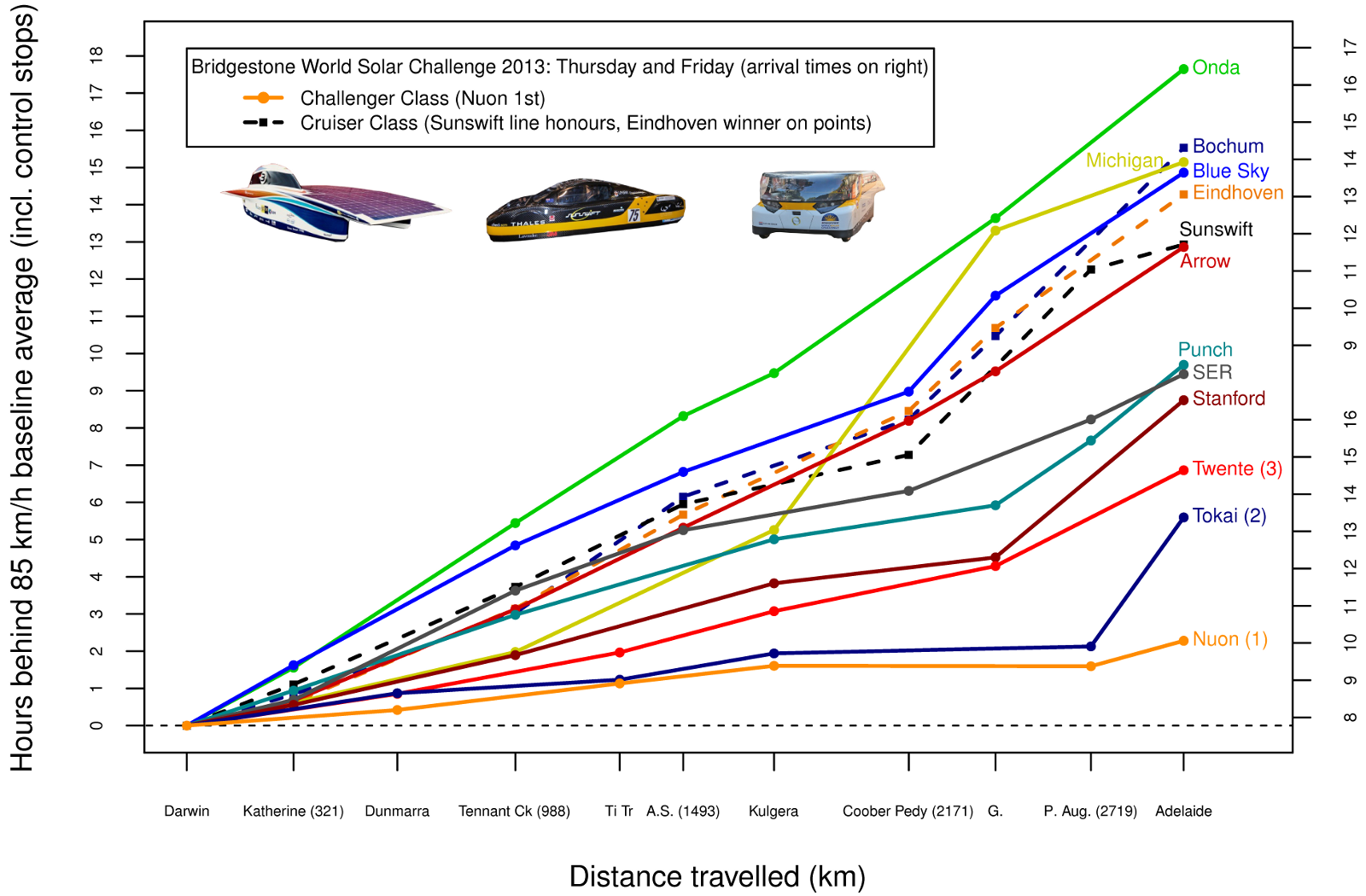
Below is my race chart for WSC 2013, where the baseline speed was 97 km/h (which equates to an overall average speed of 85 km/h when forced waits at control stops are included). Cruiser Class entries (shown as dashed lines) were treated exactly as if they were in the Challenger Class, which means that for those cars the chart tells us road position, but is not very helpful on speed. Since the vertical axis represents hours behind the baseline speed, arrival times can be read off on the right-hand scale. Clearly visible on the graph are a miscalculation by Team Tokai concerning race strategy on the rainy fifth day, and some problems experienced by Michigan and Punch Powertrain.